Quantcast
Channel: Oldenhammer in Toronto
Viewing all 190 articles
Browse latest View live

First Post: the Golden Age of Citadel Miniatures

$
0
0
Welcome to my website, showcasing my collection of classic Citadel miniatures from the 1980's, also known as Oldenhammer miniatures.

In the mid-1980's, a unique genius descended upon Citadel Miniatures and its parent, Games Workshop. It started with GW's visionary founders, Ian Livingstone and Steve Jackson. Subsequently, under the leadership of the mephistophelean Bryan Ansell, this collective inspiration intensified. A dog's breakfast of punks, hippies and hobbyists came together to transform Citadel into the closest thing that the gaming world has to Athens in the age of Pericles.

There were artists like John Blanche and Gary Chalk, who brought the vision of Bruegel the Elder or Albrecht Durer to the gaming table. At the same time, a cohort of precocious sculptors advanced the art of miniature sculpting by leagues in just a few short years. Kevin Adams, Bob Olley, Nick Bibby, Alan Perry, Michael Perry, Aly Morrison, Trish Morrison, and Jes Goodwin not only made remarkable technical progress, but they all found ways of expressing their own unique aesthetic on a canvass of lead only 25mm high.  Then there were the talented and twisted game designers, like Rick Priestly, Jervis Johnson and Graeme Davis, who wove this visual style into a multiverse which was at once so chaotic and yet so unified in its tone of adventure and insolence.

(And there was also Sabbat.)

For my own part, I love the miniatures that come from Citadel's classic period because of their baroque exuberance. They are miniatures as designed by Rembrandt, if Rembrandt illustrated Fighting Fantasy books. These minis are not overly realistic (like many contemporary miniatures from historical ranges). Instead, classic Citadel sculpts enhance the size of faces, hands and feet so that the personality of each figure can take the foreground. At the same time, these miniatures don't adopt the overly "heroic" style of later Warhammer figures (1990 to the present), in which weapons, armour and gear are exaggerated in size and ornament, making the miniatures appear more like anime robots than people. 

Oldenhammer miniatures are about drama. And no range of Citadel miniatures captures this drama in more colour than the Talisman range. Talisman, of course, is the fantasy board game with almost as many lives as a cat. Gary Chalk inked the artwork in the original set, and the Citadel sculptor of the Talisman miniatures perfectly captured Mr. Chalk's style: an etched quality with lots of character, and a whiff of John Tenniel's famous illustrations of Alice in Wonderland. The Wonderland connection is even apparent in the hearts/spades motif in some of his pictures.

Here is the first installment of my version of these great miniatures:


 Druid, Monk (with bloodied mace) and Priest (with boring sermon).


Prophetess, Sorceress and Wizard.


Minstrel, Elf and Dwarf


 Toad (modern version), Troll and Warrior

 Thief, Assassin and Ghoul

If anyone can tell me which sculptor is responsible for these miniatures, I'd be very much obliged. 
The Valley of Fire: Painted Talisman Miniatures

$
0
0
I ended my last post with a plea for some information about the identity of the sculptor of the original Talisman miniatures. Tonight, I found the answer in a tome of eldritch horror chained to a dais in my library. My hair pricked as I read this passage:

"...enslaved artisans labour night and day, their sweated toil and unremitting agony bearing new and glittering works! Yes -- at last! Superb models from the barely sentient Citadel Sculptor Aly Morrison, magically reproduced in shining metal by our myriad slave labourers... a whole range of miniature playing pieces... to compliment  [sic] the Talisman game."

This from the Spring 1986 Citadel Journal. It's good to see that they kept the help in place in those days.

In any case, I painted the range of classic 1980's Citadel Talisman miniatures to play the modern 4th edition of the Talisman game (published by Fantasy Flight Games). Happily, the 4th edition starter set contains the same core characters, which are all featured in my previous post.

 
But Talisman is not a game to be kept within the confines of the starter set. The whole point of the game is SUPPLEMENTS and lots of 'em, as numerous as the stars in heaven and the sands on the seashore. Although the modern Fantasy Flight supplements draw inspiration from earlier versions, the overlap in characters is not perfect. For reasons best known to Fantasy Flight's in-house anti-discrimination task force, old characters like the Zulu and the Witch Doctor didn't make the cut.

These are my additional Talisman characters. I tried to lend them each a sense of individuality by paying special attention to the skin tones, giving each mini a unique palette.


 Merchant, Rogue and Gladiator

Knight, Ranger and Amazon

Inquisitor (or Dark Cultist), Highlander and Swashbuckler

Sprite, Leprechaun and Gypsy


Vampiress and Dark Elf

To make the new characters, some modifications were necessary: for instance, a magic-using dwarf adventurer was transformed into the Alchemist by converting his crystal ball into a potion (by employing an upside down sword handle as the bottle's neck).

The Gravedigger -- my personal favourite in terms of angry skin conditions -- is also a conversion, receiving his shovel and rat from my hand.
Alchemist and Philosopher          

Vampire Hunter, Gravedigger and Valkyrie


Citadel Monsters: Testicles, Spectacles, Wallet and Watch

$
0
0
During the 1980's, Citadel made some of the best monsters that have been rendered in lead. The reason for their success is simple: they were sculpted to emphasize personality and character. A harpy isn't just a harpy -- it's a harpy that looks like Ronald Reagan. A dragon isn't just a dragon -- it's a potbellied drake with a pocket watch, half lizard and half merchant banker. And a giant isn't just a giant -- it's a knuckle-dragging Scots cyclops.


The Citadel giant (1987) was a lot of fun to paint. I wanted to make him seem old and unhygenic, but also robust, a little like Boris Yeltsin in his sunset years. I tried to achieve this sozzled effect by covering his pink skin with veins, wrinkles and liver spots. To underline his struggles with the bottle, I gave him a bloodshot eye and a nose ravaged by rosacea. I also added a cask of brandy to his belt and another discarded on the ground. The nearby toadstools are greenstuff and wire -- the dead bush is a painted twig from a smokebush tree.


There was one thing that troubled me about this miniature: he was wearing a short kilt, but there was nothing underneath it. This seemed a rare oversight on the part of sculptor Nick Bibby and a slander to Scotsmen everywhere.  And so to remedy this anatomical omission, I fashioned a little set of tackle out of greenstuff, and carefully pared it back with my modelling knife. The key was to achieve a sense that even though time has made this fellow sag, he is still proud of the family tartan.

Perhaps you'd like a close-up?


The Blue Dragon (1987) is another beauty of a miniature. I love the fact that it isn't slithering or rearing or launching into the old claw/claw/bite routine. Rather, this dragon is merely squatting and looking at the viewer through narrow, crafty eyes. The raised claws suggest that perhaps it is getting ready to cast a spell (a truly unusual pose for a dragon). But I prefer to think that this dragon just likes to talk. "Hmmm,"he seems to be saying, "You seem to be a smart sort of fellow. I've a real estate opportunity in Florida for your ears only."


"Coffee's for closers only."


I love Jes Goodwin's Manticore (1987) because his face bears a striking resemblance to Dee Snider from Twisted Sister. In order to do justice to this magnificent sculpture, I tried to make him look as much like a hair-metal lead man as possible.  To emphasize his grimace, muscles and feathered hair, I used a very aggressive highlighting technique.


The wings and tail of the manticore display the pleasing effect that can be achieved simply by dry-brushing a carefully sculpted metal miniature. But something is missing... No glam rocker is complete without a spattering of leopard print, so I decided to make this particular manticore a lion in the front and leopard in the back. The leopard pattern isn't difficult to achieve: start with a base of tan brown, highlighted up to a desert yellow. Add some splotches of orange which are are then (very) roughly bordered by dots and curves of medium-dark brown paint. Now he's ready for the Hammersmith Apollo!


"We're not going to take it anymore!"

Ravening Hordes: Five Sample Armies

$
0
0
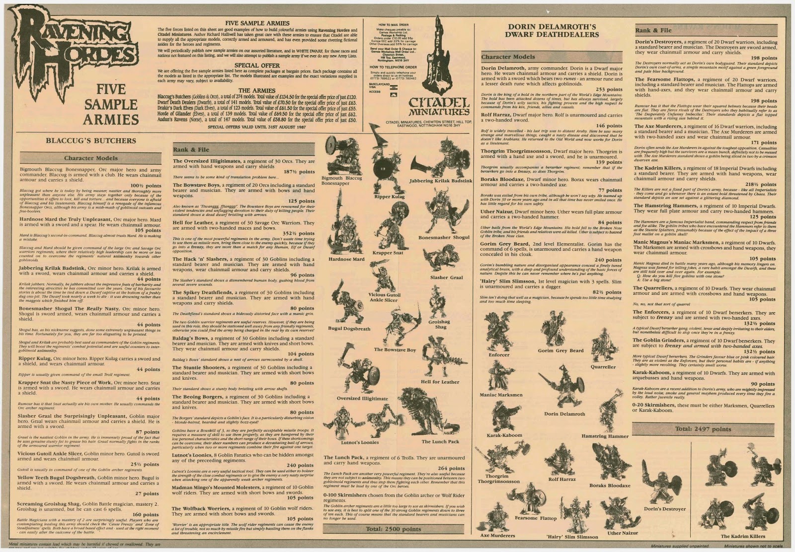
One of my favourite parts of buying old Warhammer materials from eBay is that you never know what you're going to find when you tear off the paper from the parcel.  Recently I bought a near-mint boxed set of 2nd edition Warhammer, and to my delight, I discovered that it contained the rare double-sided insert from Ravening Hordes called "Five Sample Armies" (1987).

Ravening Hordes Five Sample Armies I

The sample armies are Orcs ("Blaccug's Butchers"), Dwarfs ("Dorin Delamroth's Dwarf Deathdealers"), Norse ("Audun's Ravens"), Dark Elves ("The Dark Elves of Drakir the Destroyer") and Wood Elves ("The Royal Horde of Gilander Gulino"). Somewhat like the old Marauder Army Deals, or the modern Saga warbands sold by Gripping Beast, this insert allowed you to buy an entire army in one go... imagine a day when you could buy 274 metal minis for £120.

This slender document is special because it exemplifies how a proper army list is made (no matter what edition of Warhammer or Oldenhammer you're going to play). It's not just a ledger. Every leader and every unit in the army is given a colourful name and a spot of history to make them stand out in the imagination of the players. And yet a whole thing reads as quick as a grocery list.

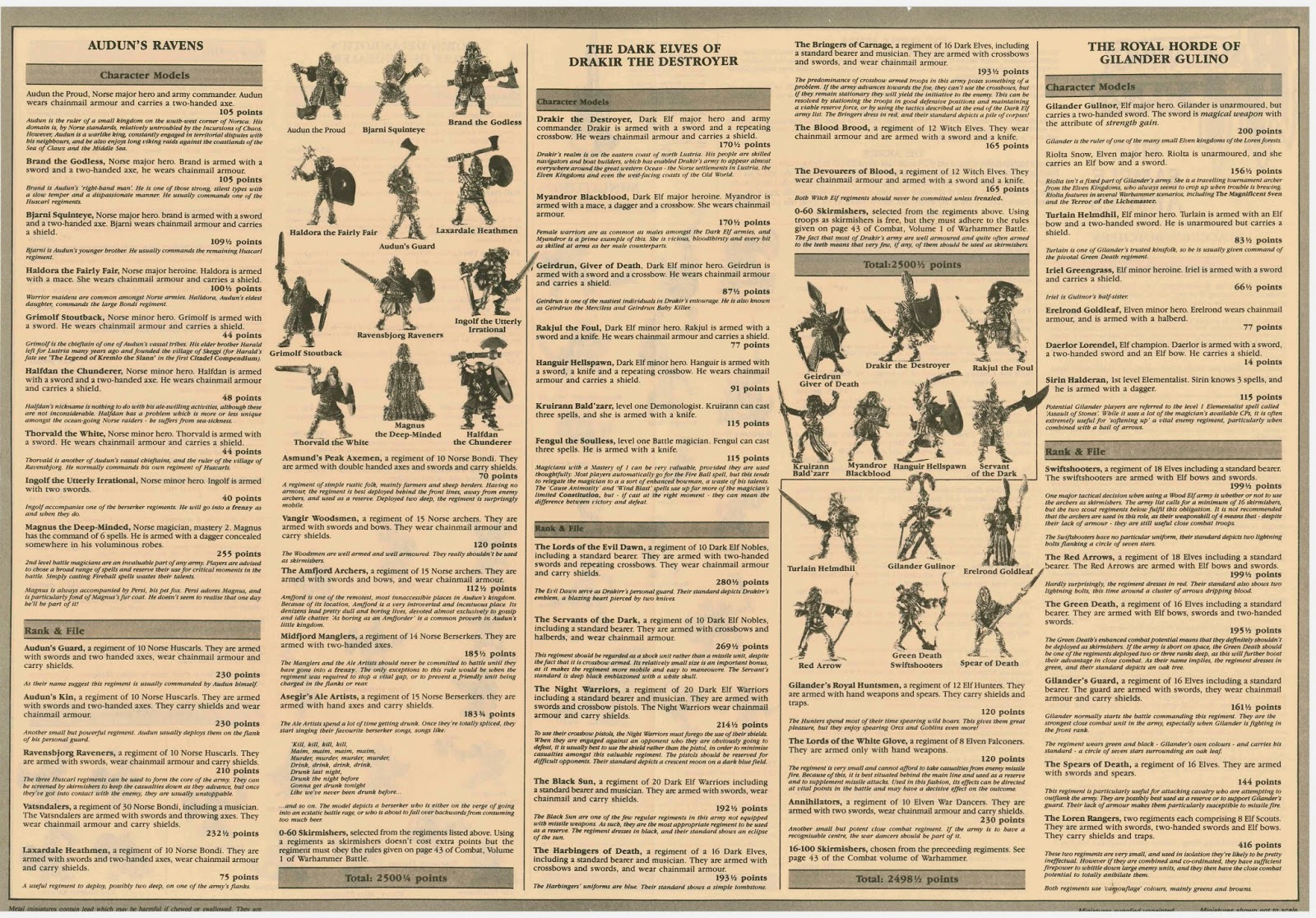
Ravening Hordes Five Sample Armies II

Another rare element in this document is the Norse army list, since this beautiful range of miniatures was largely neglected in subsequent editions of Warhammer.  We have great Viking names ("Halfdan the Chunderer" or "Magnus the Deep-Minded"), and we're treated to the entire war-chant of a berserker unit called "Asegir's Ale Artists":

Kill, kill, kill,
Main, main, main,
Murder, murder, murder,
Drink, drink, drink
Drunk last night,
Drunk the night before
Gonna get drunk tonight
Like we've never been drunk before!

They seem nice.

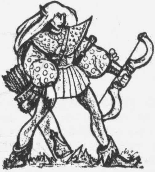
As usual for this era of Warhammer, there's a truckload of violent alliteration ("Madman Mingo's Mounted Molesters"). I was also pleased to see that the Elven list features Riolta Snow. Oldenhammer fanatics will know her as the elven adventurer who pops up in other scenarios, like the Magnificent Sven and Terror of the Lichemaster.

Anyway, if you'd like a PDF of Five Sample Armies from Ravening Hordes (1987) for Warhammer 2nd Edition, here you are:

Five Sample Armies page 1.pdf - Google Drive

Five Sample Armies page 2.pdf - Google Drive


Riolta Snow

Citadel Monsters Part II: How to get ahead in miniature painting

$
0
0

There'a a point in every man's life when he can finally step back and take the true measure of his own self. As I looked at my pics before pasting them on this post, I realized something important about myself as an artist. My only true specialty is painting acne.


"Nobody in advertising wants to get rid of boils."
He's half troll and half Billy Goat Gruff

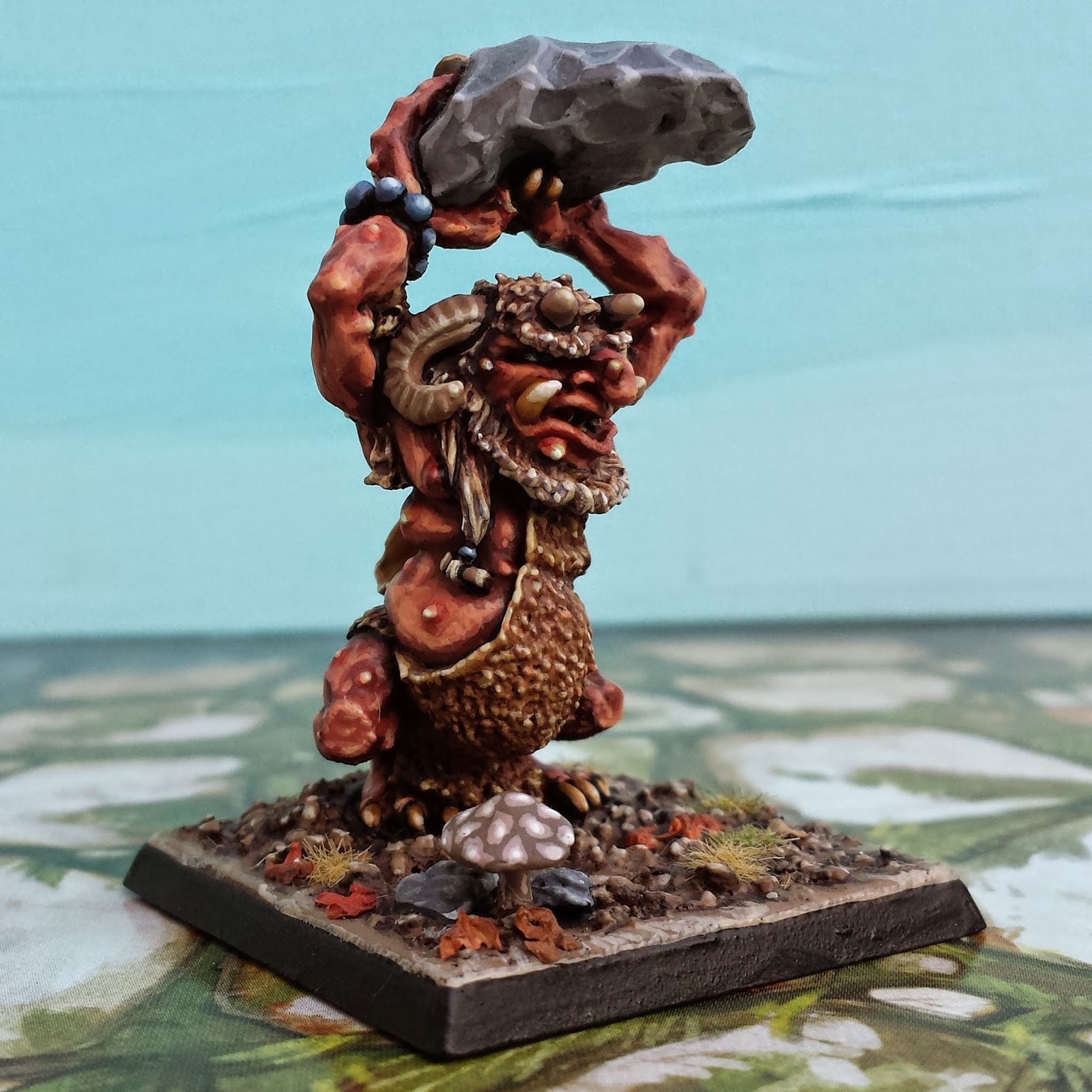
At nearly every opportunity, I garnish my miniatures with big, juicy boils. This Cave Troll by Aly Morrison (1987) is a typical example. There's a lot going on in this sculpt. I love the goat horns and tusks emerging from the deeply textured face. I also love the unhealthy slabs of fat that sag from his body. But notwithstanding the other attractions of the miniature, I can't help from highlighting his boils and making them the centre of attention.


My acne painting technique is pretty simple. It's a final touch after the rest of the flesh is fully shaded and highlighted. I then mix a very small amount of red into the mid-tone of the miniature's skin, using this to slightly blush the area around the boil. I gradually increase the proportion of red in a smaller and smaller area, intensifying the circle of infection until it terminates in a bright pink circle. The pink is then crowned with an off-white dot (to create a white-head) or a green splotch (to create a pustule) or some combination of the two.


This Marauder Troll (1989) and Aly Morrison's Warrior Troll (1987) demonstrate the same dermatological issues. I'm particularly fond of the way acne looks on supernatural skin colours. Because they're contrasting colours, the green hues in these minis give the red boils a special glow. They seem to pop right off the skin.


Off they go, in search of Neutrogena!

In my view, these two sculpts exhibit how much Citadel miniatures changed (for the worst) from the mid-1980's to the late 1980's. The Warrior Troll from '87 is packed with energy. His limbs so compressed that he seems to lunge head first off of his base. This directs your eye to his expression (with its fierce under-bite) and his slapdash collection of armoured scraps. His weapon is there, of course, but it is more threatening for being held back.

The green Marauder Troll, on the other hand, presents a much less dynamic miniature. His face is as fantastic as every other Morrison miniature, but his pose is static. All the emphasis falls on his big stone club, which draws the viewer away from the miniature's face. This focus on weapons is a hallmark of most Citadel miniatures from 1990 to the present. But a weapon can never be as interesting as a really fat pimple.

Citadel Monsters III: Painting with a Twist

$
0
0

In the mid-1980's, the sculptors at Citadel hit upon a winning formula for making miniatures that gripped the imagination. In my view, the key to painting these minis is to understand this formula and exploit it. What is this secret sauce? Keep it simple. Add one twist to give the miniature flavour. But one twist is all you need.

For example, take the classic Chaos Hounds by Aly Morrison (1987). Even your grandma knows that Hounds of Chaos must be mutated, and obligingly, these dogs have spines, two heads and ebola. But each dog has only one mutation. Other than that, they are clean models. Absent are the layers of neck flaps, spikes and scales that festooned all the later iterations of chaos hounds. However, there is something else: in addition to each model's single mutation, there is one little twist. All the dogs are thin. Painfully thin. This simple, unifying detail makes the models stand out, and suggests a sinister idea to the viewer... these dogs are very hungry.


In order to paint these dogs properly, it's important to highlight the idea of thinness. So I used a very aggressive highlighting technique without too much blending in order to make their bones stand out as much as possible. I didn't want to distract from the idea of starvation, so I kept other flourishes to a minimum: the skin colour isn't particularly supernatural, the eyes are dark and the teeth modest. It's a simple approach, but it builds on the underlying idea of the miniature.


The "Vampire Attacking" (1986) from the Night Horrors range is another great example of Citadel's approach to sculpting. The vampire itself is clearly modeled on Max Schreck's Nosferatu and so features exactly what you'd expect: an elongated skull, large hands and a feral grimace. But on top of all of this is a beautiful twist: the model is reared into an S-shape, almost like a snake. It's a simple detail, but it gives the monster a haunting silhouette, just like the original Count Orlock


"Is this your wife? What a lovely throat."


I'm not sure why, but I've long harboured the suspicion that Games Workshop held secret sympathies for the American right wing. I'm not sure why.


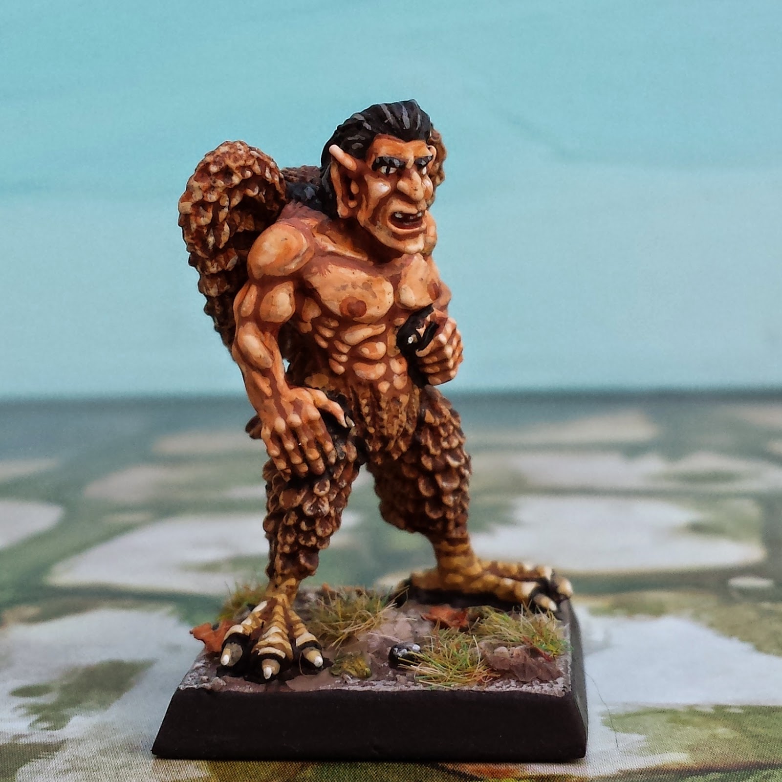
In any case, I was delighted when I went to paint the male harpy by Iron Claw (Bob Olley, 1990?) and realized that he was the spitting image of Ronald Reagan (or maybe the spitting image of the Spitting Image of Ronald Reagan). Painting him to look like the Gipper wasn't hard - I just gave him luxurious black hair and a vacant stare.


"I'm from the government and I'm here to help."

In sum, a defining characteristic of Oldenhammer miniatures is a simple, clean sculpt. These minis are never cluttered with details, but there is usually one stylistic flare. My philosophy is that painting should highlight this flare, and should otherwise stay simple too. As a last example, I offer up this citadel Fire Elemental (Nick Bibby, 1985). I love the way its stretching arms are entwined in the column of smoke billowing off its head. Simple. Odd. Beautiful.


 "What hand dare seize the fire?"


Foldio Light Box Review: Charge of the Light Brigade

$
0
0
This photo of two Oldhammer Dwarfs comes courtesy of my new Foldio Light Box from Orange Monkie.


When you photograph 28mm miniatures, everything depends on lighting. If you wish to expose the miniature's undercarriage, bring out the colours and capture detail, you will need theological quantities of light. With enough illumination, even the camera in a smartphone can take satisfying pictures (I use a Samsung Galaxy s4 and have always been pleased with its performance). But without light, even the best mini becomes a dingy turd.


When I first started this blog, I took my photos outdoors, in the shade of a sunny day (see the above Meazels from Otherworld Miniatures for an example). The results were tolerable, but there was a lot of inconvenience: the wind kept knocking over my backdrop, the lighting changed with the cloud cover, and there was an ever present danger of fresh air getting into my lungs. The obvious solution was a light box, either bought from eBay or made at home. Light boxes provide the dual benefit of concentrating light indoors while creating a smooth background for the mini. After reading some helpful advice, I decided to purchase the Foldio portable light box. 

I was attracted to the Foldio because it came with its own backdrops and a compact system of lighting, using lightweight LCD strips shining at the frequency of daylight. I also liked the fact that it packs up into a small, flat packet for easy storage.

There is a lot to like about the Foldio. It arrived at my door (to Canada from Korea) in just two days after ordering. As promised, it takes only seconds to set up, and creates a crisp environment for pictures. The lights are powered by 9-volt batteries, which means there aren't a lot of cables cluttering up the table. In sum, the Foldio is simple, easy and tidy. A picture of the same Meazels from my Foldio shows dramatic improvement: 


But the Foldio has limitations. It is small (10 inches across), so it's a poor solution for large dioramas or vehicles. Additionally, the coloured backdrop (which can be changed to your taste) is fastened to the inside of the Foldio by little more than goodwill. And the battery connectors for the light strips seem fragile, especially if 9-volts are repeatedly being inserted and detached. But the greatest drawback of the Foldio is that, as sold, it doesn't provide nearly enough light for 28mm miniatures, which leads to a lot of hidden costs. 

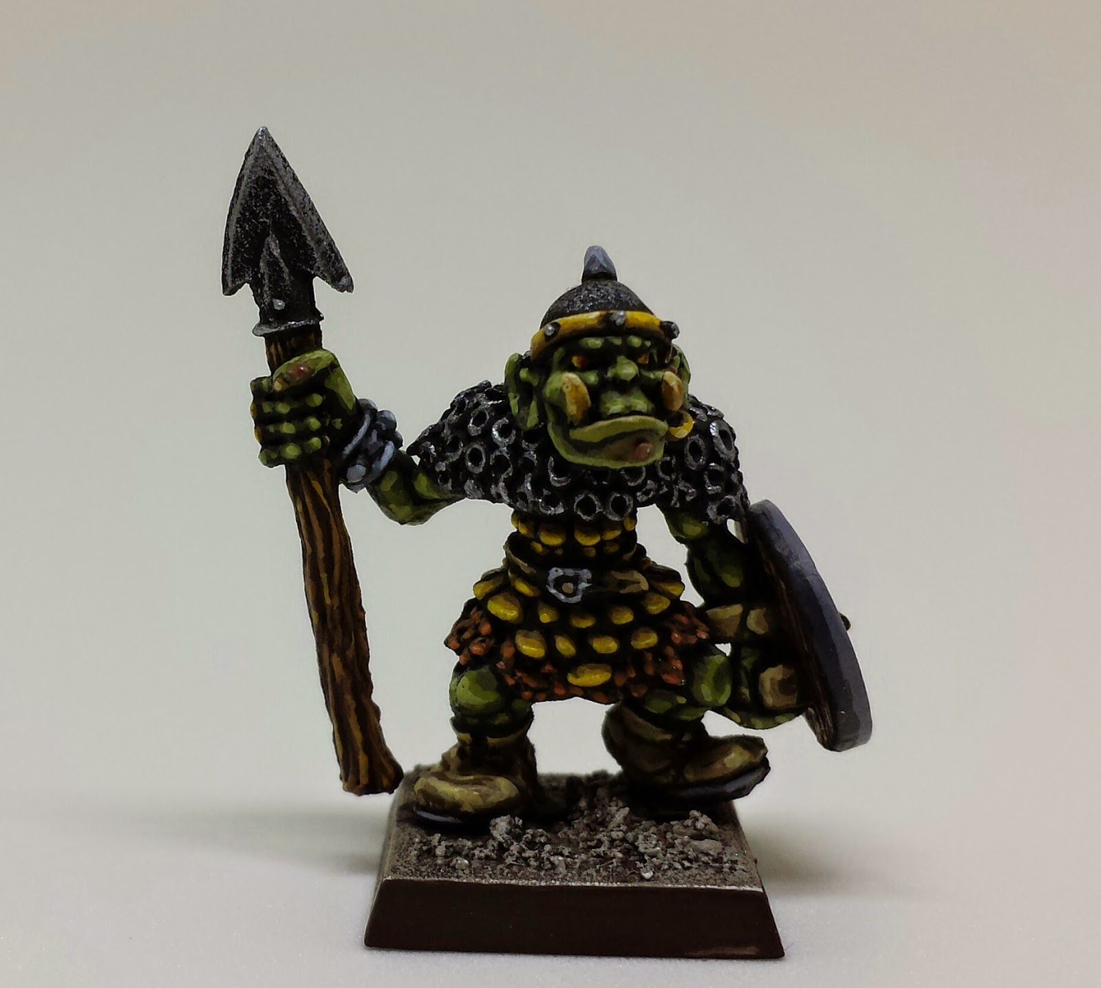
The basic Foldio is $49. I opted for the souped-up version ($59) with 2 LCD strips (both glued to the top of the light box). But with these two strips alone, this is the first picture I took of the Orc from Citadel's Talisman range:


In order to fully illuminate my miniatures, I needed to purchase three more LCD strips from Orange Monkie. I then jury-rigged stands for them so they could provide light for the flanks and bottom of the Foldio. (These stands are constructed with common hobby supplies: balsa wood, weighted down with heavy washers. I fasten the batteries to the back of the stands by way of a fridge magnet glued to the wood). 


When you add these extra light strips, plus a substantial amount of duties and shipping (not to mention batteries), my Foldio system has ballooned to almost $200. A do-it-yourself light box would have been vastly cheaper. On the other hand, the Foldio is convenient and elegant. Oh well. Light, like other precious commodities, can be surprisingly expensive.


Now That's an Orc!
Fully illuminated in a Foldio with 5 light strips


Naval Combat in Oldhammer: "All the Nice Dwarves Luv a Sailor"

$
0
0
Ship to ship combat -- with boarding parties, grapples and rams -- is the one thing missing from old school Warhammer Fantasy Battle. Or so I thought... until yesterday. I was flipping through an old White Dwarf, and stumbled on a short but pithy article by Gary Chalk. Mr. Chalk  is best known as an illustrator (creating the iconic drawings for Talisman and Lone Wolf), but he's also a modeler and a game designer extraordinaire.


His talents in all these respects are on full display in his article on naval combat. Even the title, "All the Nice Dwarfs Luv a Sailor" is the sort of goofy cultural reference that made vintage Warhammer so much fun. The rules themselves are a miracle of economy. There's little (i.e. no) emphasis on army points, or balanced rules. Instead, there are simple guidelines for bringing the ships together in a great smash and fighting infantry melees on the decks of each ship. It reminds me a little of how the Romans won the First Punic War: fight sea battles like they're actually land battles by rushing on to your opponents ship and throwing some stick around.


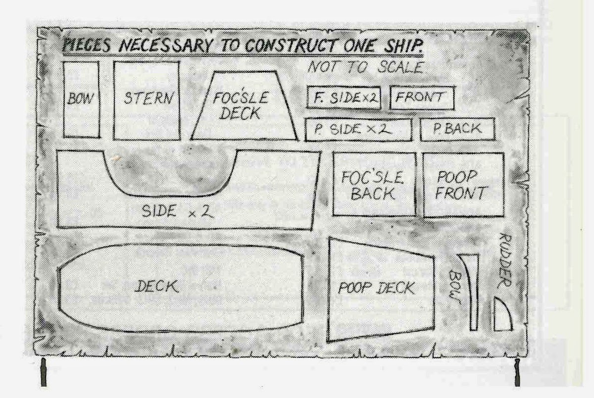
Naturally, "All the Nice Dwarfs Luv a Sailor" embodies the do-it-yourself ethos of the true hobbyist. It contains a useful template for constructing your own ships for 28mm miniatures, and tips for including such features as a winch-suspended cage of warriors that is to be swung over an opponent's ship and emptied on to the deck.The whole article is clearly designed to get miniatures on the table in the most chaotic and colourful way possible.

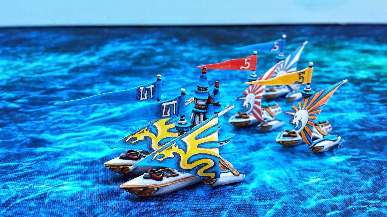
I'm hoping to get a couple of these scratch-built vessels for my own table - I may be ambitious and try to replicate (and scale-up) an elven ship from that great game, Man O'War. I'll keep the blog updated with my progress. 


Citadel Elven Ships for Man O'War (1992)

As I did a little research on these naval rules, I ran across the interview Gary Chalk did with the BBC journalist Samira Ahmed in 2012. It's clear that Mr. Chalk also pines for the days when Games Workshop emphasized creativity and freedom, rather than a rigid codex of rules: "People used to invent things -- E.g. dwarf hang-gliders and hot air balloons and invent rules to use them in the game. I came up with naval ships -- we called the game 'All the Nice Dwarfs Love a Sailor': -- they were fun add ons." He's not so keen on the current state of the hobby, summing up modern Warhammer in three words, "It's all pain."

For those who don't have access to White Dwarf 83, the best scan (much better than my own attempt) is found at the most excellent website of Project Aon, which is dedicated to the Lone Wolf books that Mr. Chalk illustrated. The pdf is here, and "All the Dwarfs Luv" starts at page 104. Let's hope Gary's great article continues to inspire a few more orcish Trafalgars!

Arrg!


It’s all pain.

The Blue Yonder: a review of the Flotone graduated photography background

$
0
0
I'm not saying that you have to have an obsessive streak if you're going to paint miniatures, but it certainly helps. My latest obsession has been improving my miniature photography, as evinced by my recent purchase of a Foldio Light box. But even then I wasn't happy because the strong light I used to illuminate the figurines' fine detail was now washing away the colours in the paint. It reminds me of the Zen proverb, medicine cures the disease, but what cures the medicine? And so I decided to invest in a professional grade photographic backdrop. 

I'm glad I did. Here's one of my first photos with this background:


By way of contrast, below is the same miniature, taken with the same lighting, but using the white foam backdrop that was included in the Foldio:


The difference is astounding.  The blue background makes the entire miniature seem warmer and more vibrant. This is especially true for the orange flesh-tones -- through the magic of complementary colours, the blue lends them a lifelike glow. The graduated effect is also important. It gives the miniature a sense of being suspended in space. Finally, I think the deepening blue draws the eye upwards and into the faces of the miniatures. (Incidentally, the Yalta miniature is one of the Moments in History Vignettes offered by that excellent organ of our hobby, Wargames Illustrated.)


The backdrop that I'm using is the Flotone Graduated Background - 31" x 43" in Blue Jay colour. I bought it for $33.50 from B&H Photo Video in NYC (+$18 in shipping and duties to Canada). B&H was a fast and pleasant retailer. The Flotone itself is a heavy PVC material with a matte finish, making it sturdy and attractive.  In order to adapt it to the dimensions of my lightbox, I cut the massive Flotone into a number of smaller sheets.


Cutting up the Flotone was a handy thing to do since it allowed me to customize a number of continuums (continua?) of gradation from blue to white. This will be useful because I don't want too intense a blue behind miniatures that are themselves blue, for fear that the background will drown them out.

My only complaint about the Flotone is that it scuffs very easily. After taking a number of photos with it, its surface was marred by smudges from my miniature bases (as seen in the photo of this Mimic). These marks are easy to wipe away with a damp, soapy cloth, but the process of washing is a pain in the ass in the middle of a photography session. 

In sum, the Flotone Graduated backdrop is a fine product and a benefit to my photography. I now think of my backgrounds like I used to think of the base of the miniature -- a precious opportunity to highlight the figure itself.


The Web of Eldaw: the first warhammer fantasy roleplay adventure

$
0
0


Thirty years ago or so role playing games and war games were not yet separate hobbies. It’s well understood that D&D evolved out of miniature war gaming rules like Chainmail (1979). But it’s also interesting to see how the first and second editions of Warhammer (1983 and 1984) straddled these two different categories, with one foot in the world of fantasy armies and the other foot rooted in role playing small encounters with lots of character development and dungeon-crawling. 


Eventually, these different impulses split Warhammer into two different games: Warhammer 3rd Edition (1987) and Warhammer Fantasy Roleplay (1986). But one of the things that made Warhammer so much fun as a war game was that it retained the flavour of a role playing game long after it was just used for table-top battles. I think that’s a huge part of why Oldhammer is so popular now.


A neglected fossil that captures this moment in Warhammer’s early history is the scenario The Web of Eldaw by Rick Priestly (1985). It’s found in a Games Workshop magazine entitled “The Good Games Guide Vol. I”, which is itself a unique historical document. The Good Games Guide attempts to survey the entire field of the hobby as it existed in 1985, listing every AD&D module with helpful commentary, detailing games as diverse as Fighting Fantasy to Advance Squad Leader, and profiling the best games from GW’s competitors, such Steve Jackson or Avalon Hill. As even the ads in this magazine show, it comes from an age when Games Workshop sold games of all sorts and so promoted the hobby at large. Sadly, this ecumenical approach to gaming was banished from GW just a short time later when it (and White Dwarf) decided to focus exclusively on promoting GW’s own games. And so, we never got a Good Games Guide Volume II.

That the Web of Eldaw is a hybrid between a war game scenario and a role playing adventure is apparent from the fact that it’s written with stats for both Warhammer and Warhammer Fantasy Roleplay. In fact, the Web of Eldaw is the first Warhammer Fantasy Roleplay adventure ever published, predating WHFR itself (the rules for which don’t seem to have been finalized by the time of the Web’s publication, since stats in the Web are wonky). The adventure consists of a short dungeon crawl, with the players taking four pre-generated characters and facing off against a referee, who takes the role of the dungeon’s guardians.

The Web of Eldaw itself is of middling quality. The text lacks any illustrations, the perils of the dungeon are boilerplate and the climax of the adventure (an army-sized battle royale between the heroes and villains) is skipped over in just a few sentences on the last page. But that being said, there are some priceless touches. My favourites include a guardian demon, who is described as “polite and apologetic but will slay anyone who tries to pass” and the discovery of a very special magic crown. Not only does the crown grant the wearer immortality, but it can only be removed with the wearer’s permission. Unfortunately, its current owner, King Lufric, was decapitated several centuries ago, and his still-living head was stuffed by his usurper into a box, where Lufric was forgotten. By the time the adventurers find this grisly trophy, the King’s head under the Crown “looks more like a brown leather bag, the features... so distorted and putrefied”. It is, however, still alive and drones in an gurgling whisper about better times.

Although the Web of Eldaw is a flawed gem, it shows how some of the most exciting parts of Oldhammer gaming come from role playing. Like the Terror of the Lichemaster, it uses very few models, making it into a quick and deadly skirmish where one bad roll can doom you to defeat. Like Blood Bath at Orc’s Drift, it throws several players together on one side, but gives them different motivations, goals and victory conditions. Like the Tragedy of McDeath, it derives its spooky mood by drawing on (and parodying) Shakespeare’s plays. And like all of the early Warhammer scenarios, it requires a referee to guide the characters into a rich adventure. Unlike these scenario packs, however, Citadel didn’t give the Web of Eldaw its own dedicated range of miniatures.


As a postscript, I'll say that I believe that war games and role playing games are once again converging, allowing each to benefit from the strengths of the other. Dead Man's Hand is a good example (although one far away from the fantasy genre). This is a skirmish game set in the Old West combining small scale competitive battles with character development and lots of story. Let's hope that games like this become more of a trend!

A pdf of the different pages of Web of Eldaw is below... Please let me know if you ever run it as a game.

The Web of Eldaw pdf full text

The Age of Dark Technology: Rogue Trader Miniatures

$
0
0

It's time to break out (and refurbish) some of my Rogue Trader miniatures! My last post was a rumination on the close and mutually beneficial connection between roleplaying games and war games in the 1980's. This conversation seques right into Warhammer 40,000 Rogue Trader (1987) by Rick Priestley.


It's easy to forget how much Warhammer 40K has changed since 1987. Contemporary Warhammer 40K (now in its 7th edition) is mainly a system for competitive tournament play, along the same lines as De Bellis Antiquitatis or Flames of War. But Warhammer 40K's original form, Rogue Trader, was something radically different. It was a story driven adventure game featuring intricate plots and deep background, all supervised by a Game Master. The result is not so much a tactical battle as a cinematic shoot-out. My favourite manifestation of this is the "Plot Generator" on pages 240-248, which includes such entries as "Abdul Goldberg store your ship - the poker game was rigged. Your crew are unhappy - having been turfed from their ship together with their possessions. The ship leaves tonight - unless you can steal it back!" (Incidentally, I'll mention that Rogue Trader seems full of Space Hebrews like Abdul Goldberg. Other examples include Pedro Cantor and Myron Jubalgunn.)

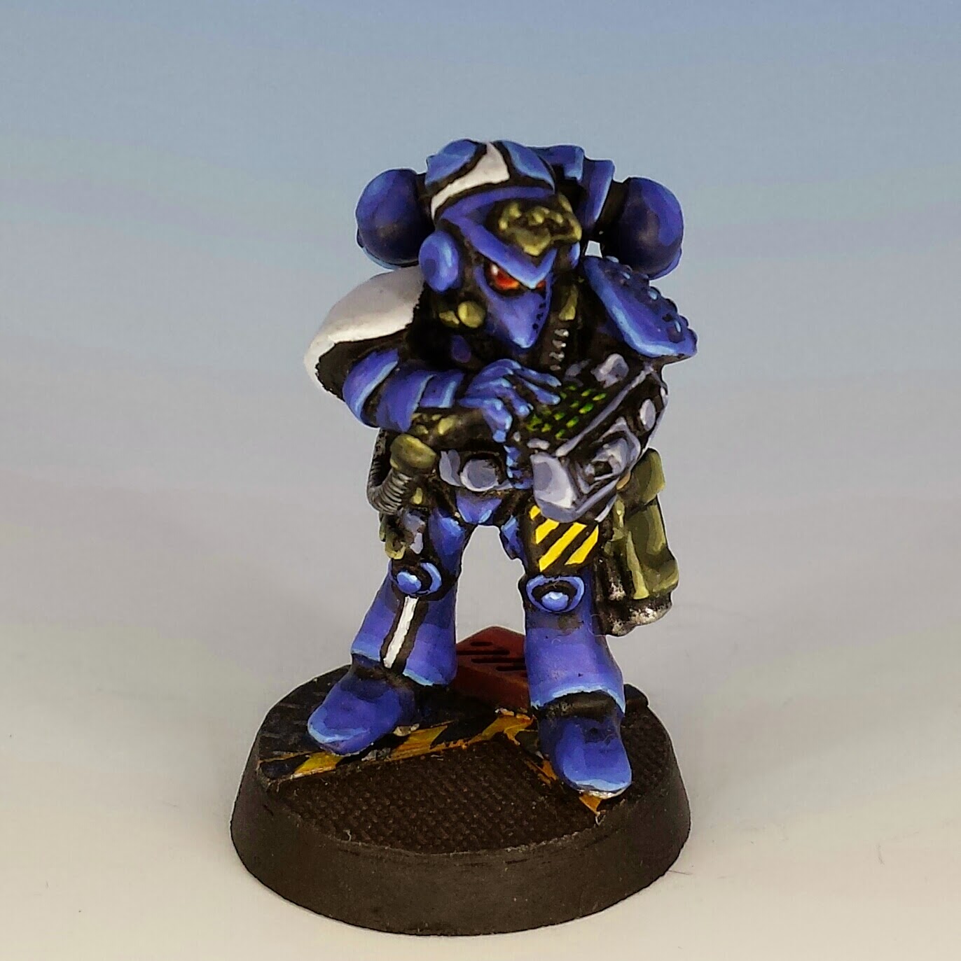
Ultramarine Communications Officer - 2nd Company

Of course Rogue Trader was not completely a roleplaying game either: the players controlled multiple models, they generally fought against one another, and these models had no capacity to develop if they survived from one battle to another. This made Rogue Trader a quick, unsentimental game. It gave players the flavour of a roleplaying game without all the calories.

This hybridization of role playing and wargaming led to some grand results. In my view, Rogue Trader remains the best illustrated, most original and engrossing rule book ever produced. It is no exaggeration to say that every one of its 272 pages contains some image, quotation or photo that stimulates the reader into populating the Warhammer world with his own imagination.


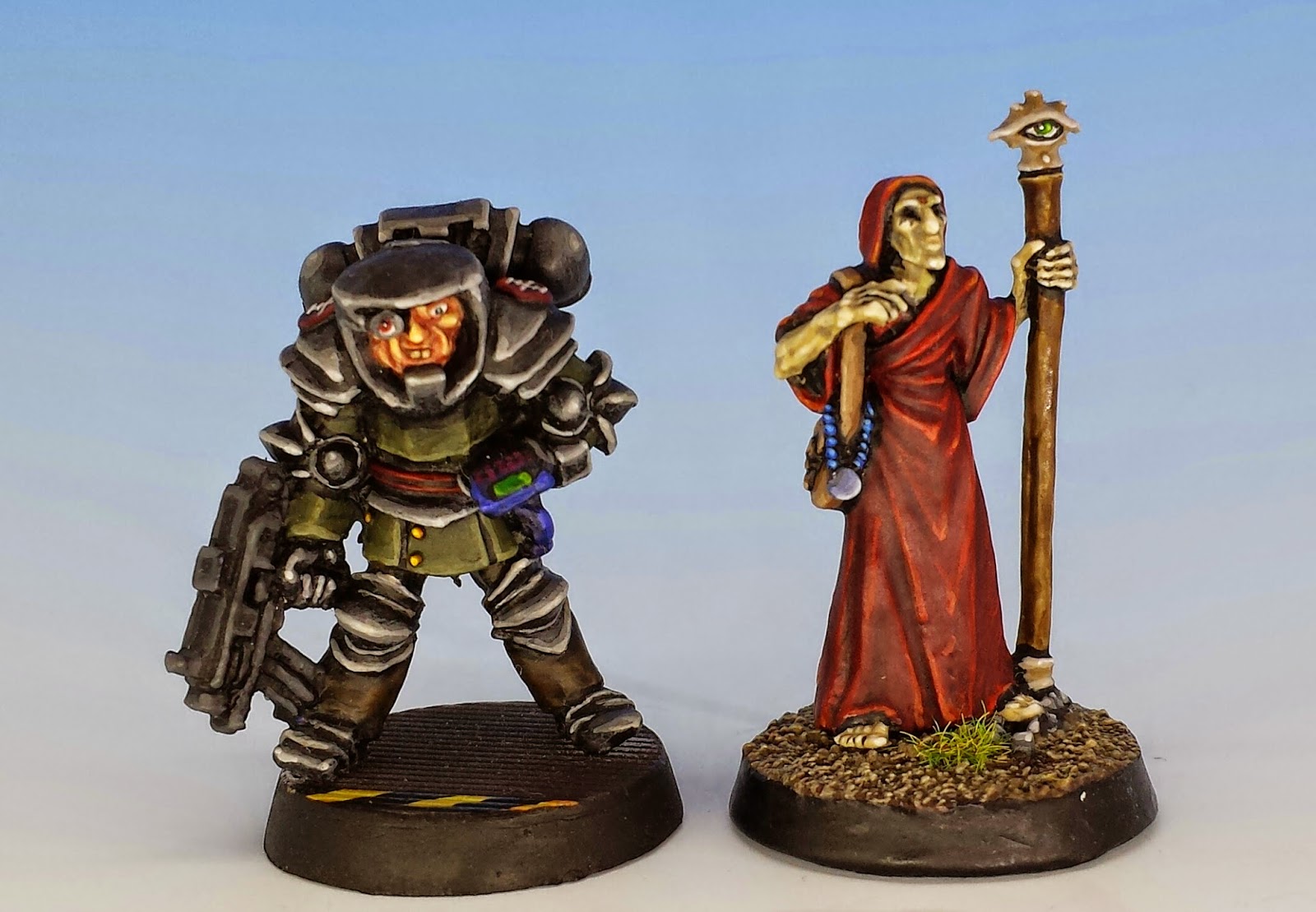
But that's not all. The story-and-character driven nature of Rogue Trader had an important impact of the designs of the miniatures. These early sculpts placed a real emphasis on giving each miniature his own persona, like bucked-toothed inquisitors, skeletal astropaths or bulbous-headed Space Marines. As well, rather than the homogenous armies that would come in later editions of Warhammer 40K, the original Rogue Trader range was populated by misfits: space pirates, adventurers, mercenaries and (my favourite) Eldar outcasts. These characters didn't and never would fit into any army list. Uniforms were not uniform and weaponry was improvised: Space Marines carried shuriken catapults and Eldar carried shotguns. These were just the sort of figures to rescue your ship from that schmuck Goldberg.


 Eldar Mercenaries (note that two are carrying shotguns)


Beyond Rogue Trader: Ultramarines

$
0
0

If you are a Oldhammer fanatic, it's easy to bash the miniatures of the 1990's as clunky, awkward, and abnormally prone tosplayingtheir limbs. Sweet Jebus - why did they think that men charging into battle would start doing jumping jacks? Don't they know that you can ruin your back if you hold a two-handed sword at arm's length for too long?

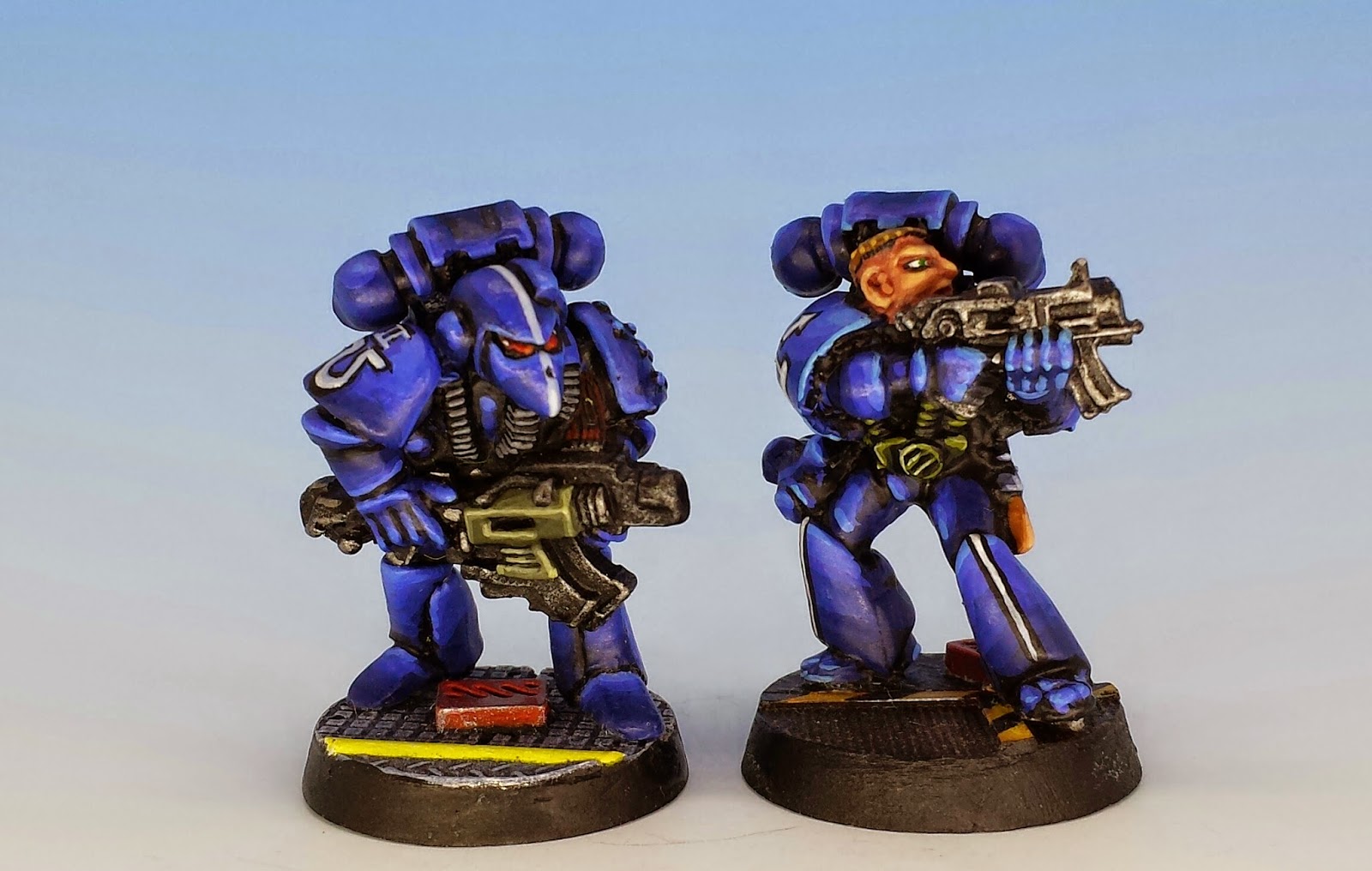
Well, before I completely lose my shit and fall into a foaming nostalgia rage, I want to qualify myself. There were still some beautiful sculps coming out of Citadel after 1990, and I'm going to show some favourites from my collection in this post, all of them Ultramarines. The best of the best, in my view, is Jes Goodwin's solid metal Space Marine Dreadnought (1994).


Dreadnoughts should be awkward and clunky, so I guess Goodwin's sculpture played straight into the prevailing aesthetic of the Citadel studio. Its square posture broadcasts power. But more than this, this is a well balanced figure: The smooth shapes of its armoured surfaces contrast beautifully with the textured machinery in the rear of the figure and under the plates.


I decorated the miniature with some modern plastic bits, like purity seals and a laurel crown. The inscription on his right plate ("VAE VICTIS") means woe to the conquered.  The battle damage is silver paint applied to the edges of the armour, sometimes with an outline in black or grey. I distressed and rusted the gears by applying thin washes of Chestnut Ink... ah, the long out-of-production Chestnut Ink from Games Workshop. I still have the first bottle I bought (about 10 years ago), and I carefully dole it out like precious saffron, since I don't believe I'll ever see its like again. Urk. I can feel the nostalgia rage coming over me again.


Speaking of nostalgia, in my last post I wrote about the role-playing elements in the original Rogue Trader rules set (1987). I received a lot of thoughtful responses, several of them pointing out that more recent editions of Warhammer 40K have tried to re-insert a role-playing feel into the game, but that there's some resistance from 40K players, who just want tournament play.

And yet, I still think there's something special about Rogue Trader. But what? Over the past week, I've been flipping through my battered copy of RT, and comparing it with the most recent Warhammer 40K edition that I own (5th edition published in 2008). It's hard to fault the more recent version: it's a polished book, with pithy text, spacious pages, and lots of bright colour photos of well painted dioramas.

In contrast Rogue Trader is primitive. It's predominately printed in black and white, with just a few grainy photos of miniatures. Although illustrations abound, they are by almost a dozen different artists, resulting in a confusing aesthetic. The text is dense and long as the King James Bible -- if there was an editor, he had a light touch, or simply died of fatigue. And the layout is cramped, with a self-conscious effort to make the page look like a blue-print or a technical manual.


All of these elements should make Rogue Trader a disaster. But they don't -- in fact, they make it a classic. And I think the reason is because the claustrophobia in the pages of Rogue Trader oppresses the reader with the claustrophobia of 40K universe. The book causes sensory overload, in the same way that you would be overwhelmed when entering a Chapel of the Administorum or when walking the galleries of a Hive World. In other words, this book didn't just describe a game -- it was a portal into a different world.

But this sort of stunning success is its own undoing. The profits and popularity of Rogue Trader led to better production values for subsequent editions: colour printing, tighter writing and cleaner layout. All of these improvements are generally good things... but none of them conjure up the shadowed world of the Rogue Trader.


Orctober Fest: Evolution of the Orc

$
0
0


Welcome to Orctober! I'm proud to joining my fellow Oldhammer fanatics Erny (who invited me to the party) and Zhu (who drew the gorgeous Orctober Fest banner). I hope lots of others join the fun!

Big. Bald. Green. This is now the iconic image of the orc, and it's one of Citadel/Games Workshop's enduring contributions to the fantasy genre at large. But it wasn't always so. In this post, I want to analyze the evolution of orcs (and their miniatures) from their beginnings to the present day. I'm thankful to a number of very talented miniature painters who joined me in providing the pictures to illustrate this evolution.


Magar Ironfist painted by the author, Citadel (sculpted by Perry Bros., 1985) 


Before Citadel came along, orcs were not big and green. As Zhu has demonstrated, monstrous orcs are the invention of JRR Tolkien. But Tolkien was vague about the appearance of what he named "goblins" in the Hobbit (1937), and "orcs" in the Lord of the Rings (1954), merely calling them "ugly" and arming them with "curved scimitars".  However, we know they were short; in the Fellowship of the Ring, a "huge" orc-chieftan is remarkable for being "almost man-high". 

In his letters, Tolkien described orcs as "squat, broad, flat-nosed, sallow-skinned, with wide mouths and slant eyes." The short, sallow orc is tolerable as far as it goes, but unfortunately Tolkien went on to call them, "degraded and repulsive versions of the (to Europeans) least lovely Mongol-types." This is racist (re: the Mongolians) and ridiculous (re: the orcs). The Mongol king Kublai Khan is about the least orcish face I can imagine.


Then Gary Gygax came along, and improved on Tolkien's orcs by wrapping them in bacon: "Orcs appear particularly disgusting because their colouration -- brown or brownish green with a bluish sheen -- highlights their pinkish snouts and ear. Their bristly hair is dark brown or black..." (Thus spake the Monster Manual). The artist Dave Sutherland ran with this reference to snouts and made orcs into pig-men in his iconic image in the Monster Manual (1977). Gone is the eastern-tinged scimitar, the slant eyes and the broad face.

But hairy, porcine orcs didn't inspire miniature sculptors (with a few exceptions). Most early orc miniatures were ugly and fanged in a generic sort of way. This simple pattern continued in the early Citadel sculps (like the Fiend Factory's Red Orcs launched in 1979).


Fiend Factory FF24 - Red Orc In Chainmail With Sword, sculpted by Michael Perry, (1980) painted by BPI


But somewhere around 1982, under Bryan Ansell, Citadel orcs began to evolve. Starting with the Fantasy Tribe range, their skulls became elongated, allowing for an exaggerated jaw and underbite. The ear became pointy, the brow beetling, the head smooth. Orcs became taller but they also grew more stringy, with long, apish limbs. They turned into a new race. 
 
In my view, Harboth's Black Mountain Boys are the best example of these early orcs. I don't own any of these striking miniatures, but here's one (with slight conversions) painted by Peter Armonstrong and posted to his excellent blog. I love those teeth!


Harboth's Black Mountain Boys, painted by Peter Armstrong, Citadel (circa 1985)


The next stage in the evolution of the orc occurred when Bryan Ansell hired a young novice sculptor named Kevin Adams. And all of a sudden, this new race of long-skulled beasties had their own Loki to blow life into them. Adams has many colleagues in the top tier of the sculpting profession, but no one (no one) has a greater talent for infusing orcish features with personality. During the mid-1980's, Citadel (and Adams) created the most compelling orcs ever released: grinning, boasting, clowning and yet always menacing.


Orc Commander, painted by the author, Citadel (sculpted by K. Adams, circa 1985)


I will touch the orcs' subsequent history briefly. As with so much else, throughout the late '80's and '90's, Citadel took a "moar is better" approach to orcs, turning character into caricature. Their heads continued to expand, reaching hydrocephalic proportions. Weapons and muscles also became oversized. But worst of all, the joie-de-vivire that Adams invested into the race of orcs was gradually overtaken by nothing more interesting than savage violence. In my view, this genetic decline started with the Marauder sculps by Trish and Aly Morrison (1988), and headed downward from there.


Although I don't love the Marauder Miniatures, I do love this paint job by Blue. His clean style gives these orcs a compelling comic-book feel. His bases are also a work of art.

What does the evolution of the orc signify? That's up for grabs, with some people even writing academic papers on the subject. My own view is that orcs gradually changed because Warhammer gamers wanted to play games as orcs  rather than merely fighting them as enemies in dungeons. Tolkien's Asiatic grotesques, or Gygax's pig-faced orcs simply don't have the depth or charm to make gamers want to inhabit them as characters. In the 1980's, the genius of Citadel was to reimagine orcs in the image of Citadel's clientele: a rowdy, gangley tribe of punks.


The success of these Warhammer orcs was so dramatic that it influenced everything that came after. Although few game designers were able to maintain the mischievous mentality of Citadel's 1980's orcs, their physical image is stamped deeply into our collective imagination. Now systems as widely separated as World of Warcraft or Shadowrun feature the green skin and dramatic under-bite that was pioneered at Citadel. There's something in that face that says, "I'm big, I'm violent, and I'm also a lot of fun."


Orctober: Green Orcs and Ham

$
0
0


For Orctober I've been discussing the evolution of the orc, from  Tolkien to the present. There's one feature I'd like to zero in on today... the colour of their skin. How did they become green?

I've already noted how Tolkien envisaged most orcs as having sallow (i.e. yellow) skin. However, in The Lord of the Rings he wrote about different breeds of orc. In Tolkien's mind, the nastier the orc, the darker his skin. In Moria (in The Fellowship of the Ring), Gandalf surveys a war party of orcs and mentions that some are stand out as "large and evil: black Uruks of Mordor". (Uruk is the word for orc in Black Speech). And in The Two Towers (1954), the narrator describes one of Saruman's elite orcs as "a large black Orc". Whether Saruman's black orcs and Mordor's black orcs are the same breed is not clear from the books, but the important thing for my purposes is that they were black.

Hmm, asiatic orcs, black orcs... Tolkien does seem to be hitting a lot of squares on the Bingo Card of Unfortunate Stereotypes. Well whatever - we know from the Old Man's speeches and letters that he abhorred apartheid and antisemitism.

In any case, Gary Gygax's pig-faced orcs were not really green either. The Monster Manual (1977) describes them as "brown or brownish green with a bluish sheen". Ah yes, the colour of a spoiled ham... but still not the snot green that we've come to expect.
 

I have two theories for how orcs became green. The first is that it is all Spiderman's fault. Although I can't find any trace of green goblins in early English poetry or children's books, Spidey's nemisis, the Green Goblin, has been kicking around since 1964. The influence of Marvel Comics has been so great, it seems natural to me that the bright green of this villain's skin would have leached into the fantasy genre.


My second theory is less likely but more fun. I think (or hope) is was Fungus the Bogeyman who turned orcs green. For those of you who were cruelly deprived of bad influences when you were children, Fungus the Bogeyman (1977) is a children's book by British artist Raymond Briggs. It has been called "the nastiest book ever published for children" and "a masterpiece of complex nihilism". The titular character has that fluorescent green which became the hallmark of Games Workshop's orcs in the early 1980's. So how did orc's become green? It was Fungus' fault.


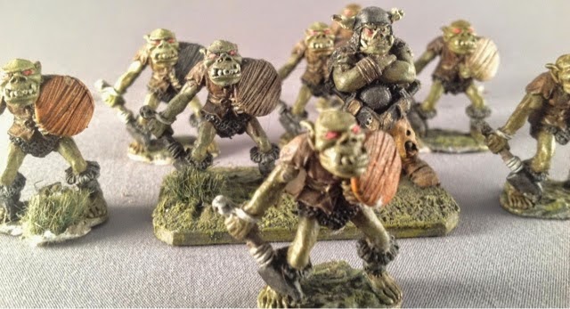
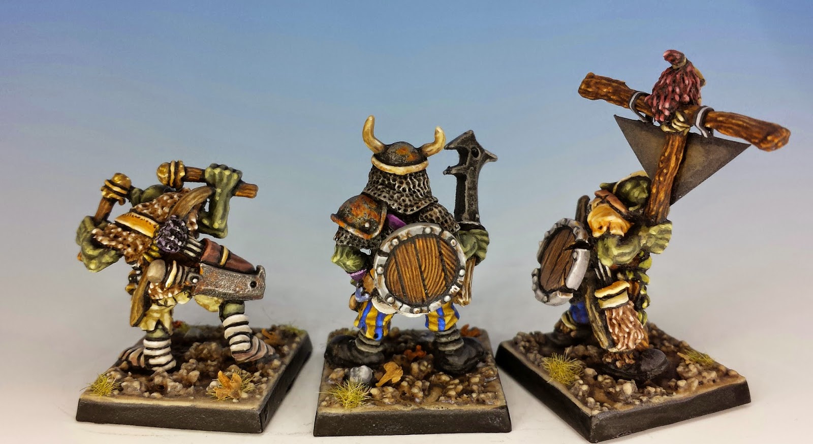
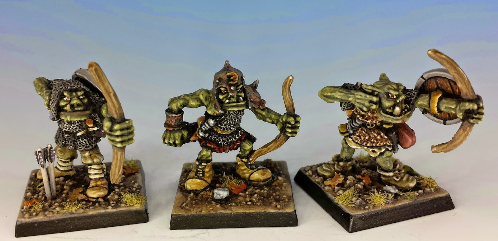
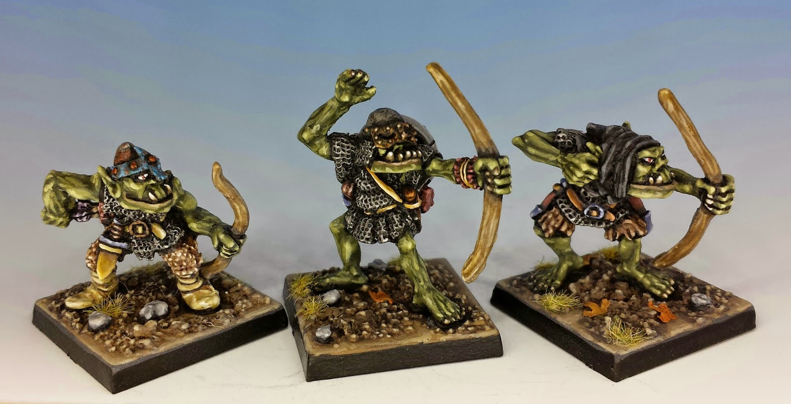
Harboth's Orc Archers, Citadel (sculpted by Kev Adams, 1987)

Orctober: Harboth's Orc Archers

$
0
0


If you can't already tell by the nostalgia rages that often engulf this blog, I'm a fan of classic, 1980's style Warhammer. But there's one issue on which I part company with the canon. I've never been able to swallow the bright green of traditionally painted orcs. After GW introduced Citadel Inks in 1988, things only got worse -- Eavy Metal began recommending that orcs be glazed in yellow ink, which only added to their glow (see White Dwarf #100 for example). These orcs seemed too goddamn healthy to me, as if they were about to suspend rampaging and try their hand at photosynthesis. 


Nope, for me, Orcs should be green, but it should be an unwholesome green -- the colour of a damp rug or a forsaken tub of yogurt. To showcase my pigment of choice, in this Ortober post I'm presenting my rendition of Harboth's Orc Archers, sculpted by Kev "Goblin Master" Adams and released in 1987.


Above is the command section. I painted the skin tones in five shades, starting with (the old) GW Catachan Green as the base layer. For the next shade, I added a little GW Rotting Flesh to the mix, and a little more for the next layer, finally working all they way up to 80% Rotting Flesh as the highest of highlights.


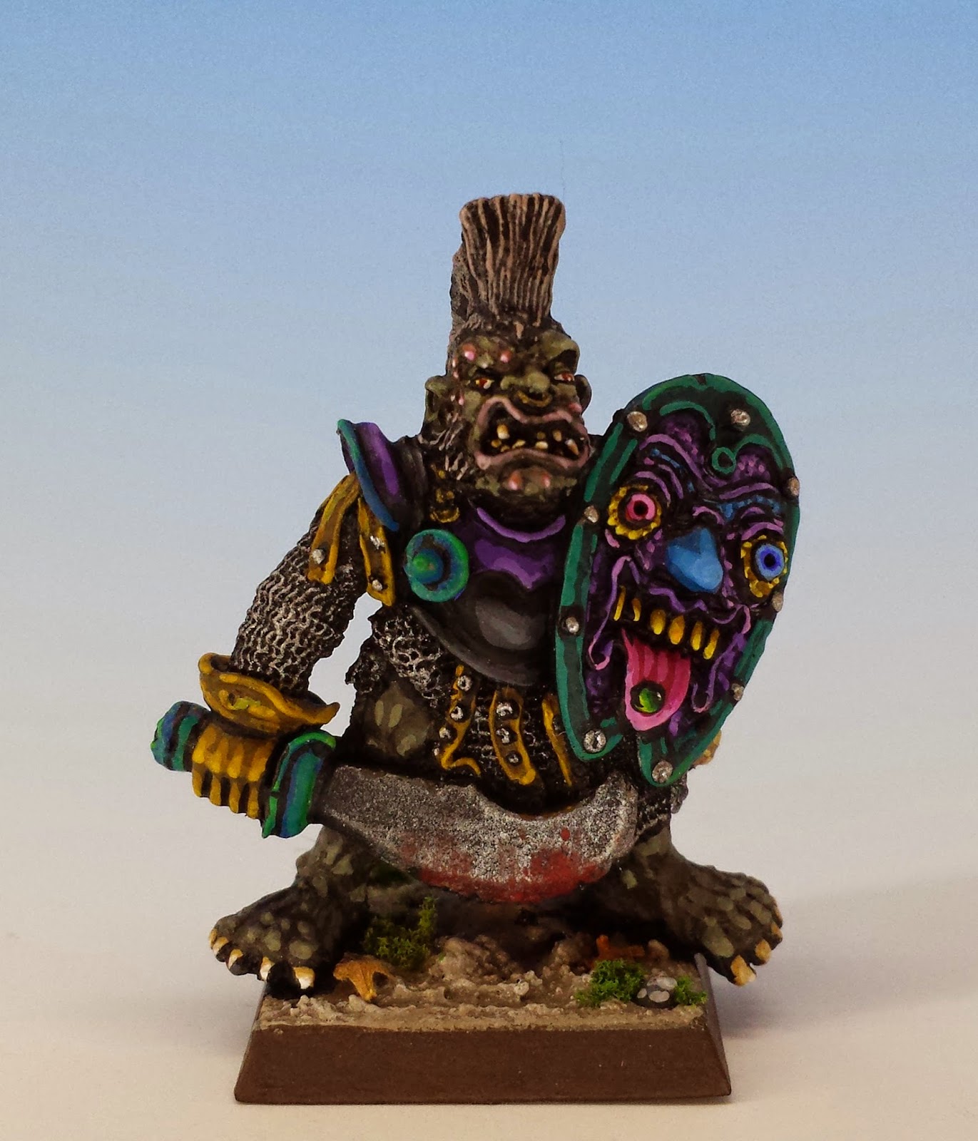
Another issue I struggle with in orcs is ornamentation. Traditional Games Workshop orcs (especially when painted by the Eavy Metal crew or Kevin Adams himself) often featured bright shields with leering faces of extraordinary artistry. First, I don't have that talent for these embellishments. But second, I think your average goblinoid marauder would spend less time accessorizing and more time eating prisoners. So my orcs tend to be less flashy. The leaders sometimes sport looted gear (like Harboth's striped pants) but in general, their equipment is simple and in bad repair. I try to add interest to the miniature through rust effects and other signs of wear.


The rank and file are a mixture of original Harboth boyz, plus some other vintage orc archers who took my fancy. I don't like my orcs looking too uniform...


Their traditional battle cry is "Pulp the stunties!"


Pig Faced Orcs: Off the Endangered Species List

$
0
0


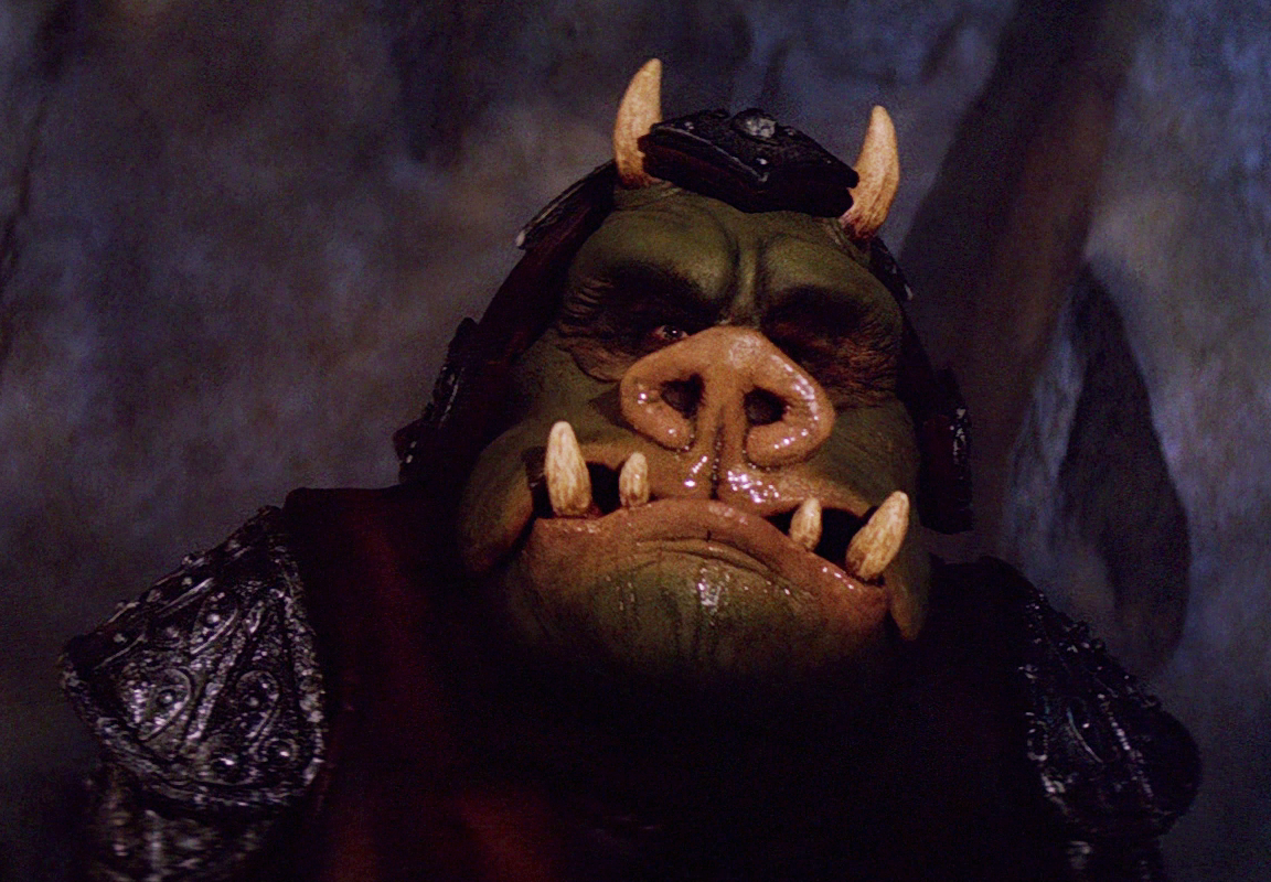
As a coda to my series on the evolution of orcs, I'd like to return to the pig faced orc. As other scholars of orcish lore have already noted, the pig faced orc's origins can be traced back to the wonderful Tolkien illustrations of the Brothers Hildebrandt (1976) or, even to the Goons in Disney's Sleeping Beauty (1959). However, it was Gary Gygax and Dave Sutherland who established pig faced orcs as part of the fantasy role-playing canon, by making them the official sponsor villain of Advanced Dungeons and Dragons (circa 1977). Perhaps the apex of this orc's fame was the Return of the Jedi (1983), when they made a cameo appearance as Jabba the Hutt's guards. Sure, they were called "Gamorreans" and not orcs, but if it walks like a pig, and squeals like a pig, then it's probably a pig.*


Unfortunately, the pig faced orc was not long to enjoy such fame. The other illustrators of AD&D rarely followed Sutherland's cue. Similarly, few miniature sculptors carved orcs in this style (with the central exception of Minifigs), especially as Citadel's bald and underbitten orc climbed to the top of the foodchain. As later editions of D&D came and went, the pig faced orc seemd to go extinct.
 

Seemed to go extinct... but not quite. In the last few years, the pig-faced orc has made a triumphant comeback. I think most of the credit has to be given to Otherworld Miniatures, who had the vision to commission some of the most talented sculptors in the field to produce new miniatures inspired "by the iconic imagery of the early role-playing games". Among their first line of minis was the fantastic range of pig-faced orcs, sculpted by Kev Adams and featured (with my paint job) here.

Otherworld Miniature are the other white meat.


But that's not all. Wargames Foundry is selling a new line of pig faced orcs sculpted by John Pickford for their new fantasy wargame, God of Battles. (I find JP's orcs more snouty than piggy, but pork is in the eye of the beholder.) Best of all, however, it appears that Dungeons and Dragons is readopting the pig faced orc as their monster of choice. In 5th edition D&D, orcs are now described as
having "stooped postures, low foreheads, and pig-like faces with prominent lower canines that resemble a boar’s tusks." Piggies returning to D&D? That's what I call the circle of life.


Ultimately, I attribute the survival of the pig faced orc to the same love of early gaming that has brought us Oldhammer. Yet it is not merely nostalgia. There is a powerful villany in the pig faced orc. Your run-of-the-mill green orc may be scary, but pig faced orcs are deeply weird. They represent our world rebelling against us. What we eat is now going to eat us. Oink oink.


*Or it's Ned Beatty.

Citadel Gothic Horror Miniatures

$
0
0
Call of Cthulhu, in my view, is the greatest role-playing game devised by hand or pseudopod. First published in 1981, Call of Cthulhu was an early entrant on the field of role-playing games, and in the intervening 33 years (and 7 editions) it really hasn't changed that much. It's like the shark: a primitive animal that didn't need to evolve, because it was born deadly.


The games follow an arc that never gets boring: bookish heroes unwillingly learn that below the facade of polite society lurks conspiracy and madness. As they take up the battle against the conspiracy, they find themselves going a little mad too. The rational tools of research, deduction and inquiry descend into a climax of paranoia, overreaction and hysteria. In the face of unnameable horrors, the characters abandon themselves to suicide and sawed-off shotguns. It's like grad school all over again.


Games Workshop had an early role in popularizing Call of Cthulhu: Starting in 1983, White Dwarf began publishing a series of excellent articles and adventures, quickly becoming the first main organ for CoC. Even better, in 1986, Citadel Miniatures released the Gothic Horror range of miniatures, which added an alternative to the primitive sculpts offered by Ral Partha. Another gorgeous contribution to the game was GW's Halls of Horror (1986): a set of floor plans drawn to the same scale as the miniatures (prefiguring floor plan games like Betrayal at the House on the Hill or Mansions of Madness). Sadly, the only thing Citadel failed to do was release a range of Cthuloid monsters, like Elder Things or Shoggoths.


I love the Halls of Horror floor plans (two of which are featured here) precisely because they have an illustrated feel, bringing the game board into a story-book realm that matches the larger-than-life style of the Citadel Gothic Horror miniatures. The details in these rooms also exemplify the goofy black humour of GW's heyday: spooky portraits, heads in jars, and lots of taxidermy. 


My happiest role-playing experiences have all arisen from Call of Cthulhu: grand campaigns that spanned generations of characters and villains. But for reasons which have never been clear to me, I've never used miniatures in any of my games. This is something I've decided to remedy, by finding and painting as much of Citadel's Gothic Horror range that I can find. More pictures to come!


Gothic Horror meets Eldtritch Horror

$
0
0
After I finished my first game of Fantasy Flight Games latest Cthulhu boardgame, Eldritch Horror, I was certain of two things. First, it was the best Lovecraftian boardgame that I've ever seen, leaving earlier attempts (like Arkham Horror) in the dust.

Second, I was now in the grips of a compulsion to paint a proper set of miniatures to match the characters in this excellent game. That's when I started obsessively collecting miniatures from Citadel's Gothic Horror range. I love trawling through eBay and the Stuff of Legends, looking for the perfect miniature to capture in vintage lead the characters portrayed in a modern game.

Below you can see the results: twelve miniatures representing characters for Eldritch Horror, juxtaposed to the illustrations from the game that inspired the minis' selection and colour scheme.


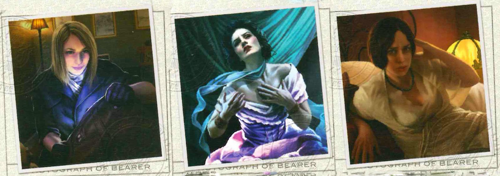
Heroine (variant) (1986), Lady Jane (1987), and Female Detective (1987) from Citadel Miniature's Gothic Horror range


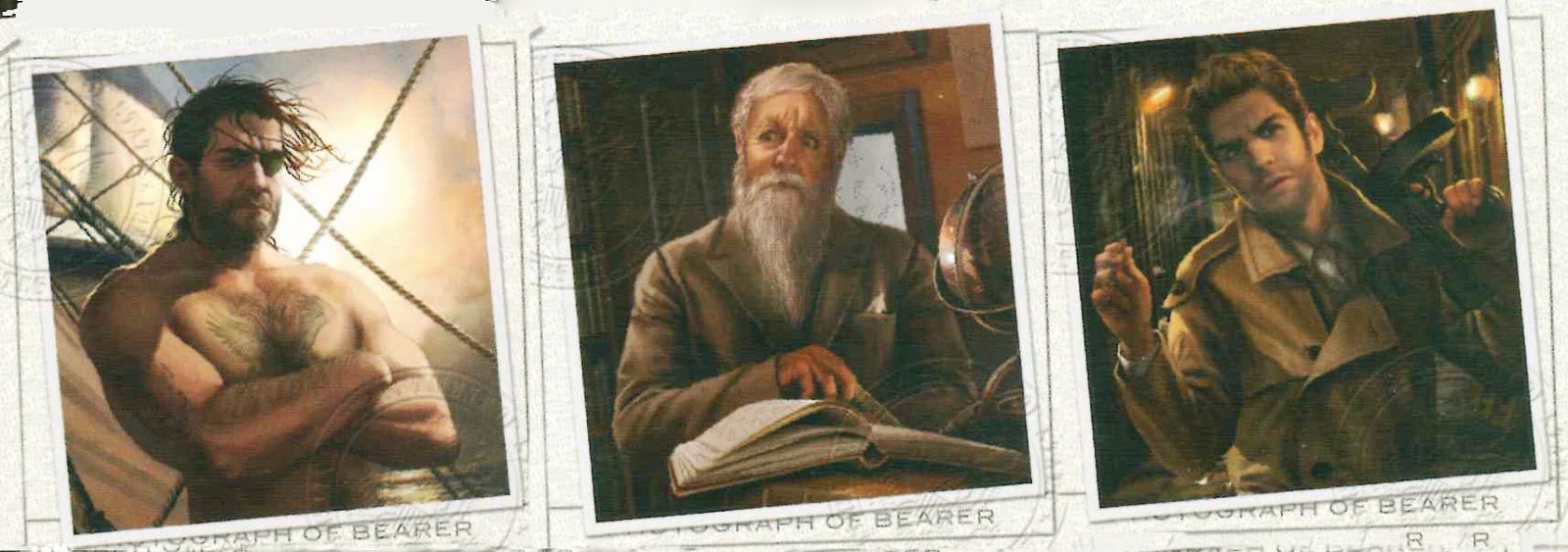
FFG's illustrations for Trish Scarborough (the spy), Lola Hayes (the actress), and Jacqueline Fine (the psychic) (illustrations by Magali Villeneuve)


Eldritch Horror is so successful because it doesn't merely throw a random collection of monsters at the heroes, but gives them a sense that they are dealing with a worldwide conspiracy. In fact, Eldritch Horror is the first boardgame that I've played that condenses many of the best elements of a Call of Cthulhu role-playing campaign into a single session lasting just a couple hours. Just like grand CoC adventures like The Masks of Nyarlothotep (1984) or Shadows of Yog-Sothoth (1982), the characters can travel across the globe searching for clues in remote jungles or exotic cities -- or they can stay put in New England, rambling through Arkham and researching forbidden spells. Playing the game, you have a delightfully Lovecraftian sense of having many choices, but few good options.


Fighting Man (modified with eyepatch) (1986) and Down & Out (1987) from Citadel Miniature's Gothic Horror range. Cagney (circa 1987) from Citadel Miniature's LE3 Gumshoe range


FFG's illustrations for Silas March (the sailor), Norman Withers (the astronomer) and Mark Harrigan (the soldier) 


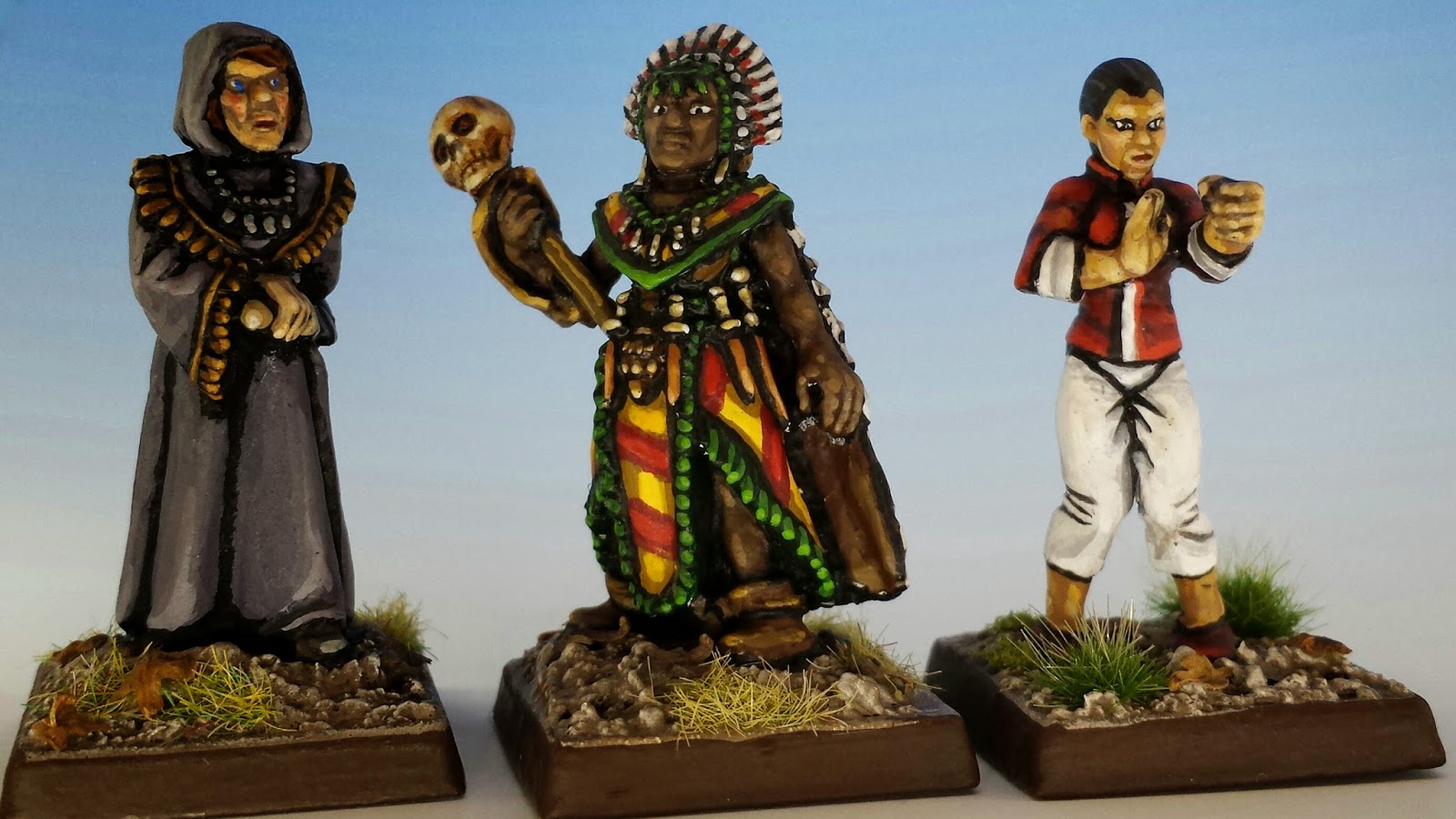
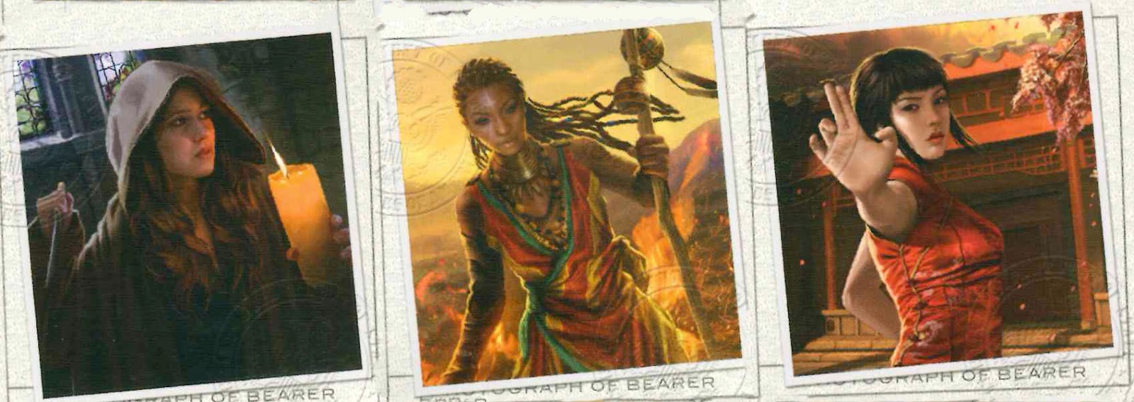
In the 1980's, miniature manufacturers didn't have the same zest for multiculturalism that pervades the modern gaming industry. So I had to wander a little further afield to find suitable miniatures for some of the characters, especially the women. The shaman and cultist are preslotta minis from Citadel's underated C30 Amazon range. And the martial artist is a modern sculp by Kev White of Hasslefree Miniatures. (I adore Hasslefree's clean, simple sculpting style. It also offers a great range of female characters. Highly recommended).


 Sisterhood Novice (1984) and Mother Samantha (1984) from Citadel Miniature's C30 Amazon range. Meiying (date unknown) from Hasselfree Miniatures Modern Martial Artist range


FFG's illustrations for Diane Stanley (the redeemed cultist), Akachi Onyele (the shaman) and Lily Chen (the martial artist) 


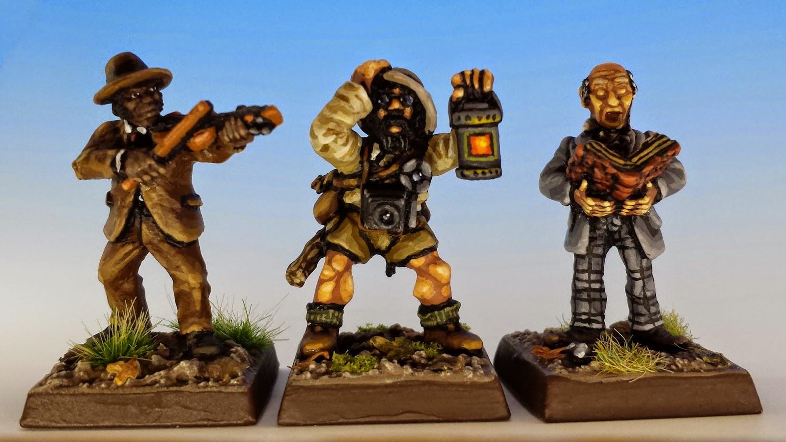
Another great source of Lovecraftian miniatures is Wargames Foundry. They don't have a dedicated Cthulhu range, but their huge and eclectic collection of miniatures offers many intriguing possibilities, including Tim Prow's Victorians, the Old West, British in Africa, and Egyptian Adventure (also by Tim Prow). Not only are they lovely, characterful sculptures in their own right, but they also harmonize nicely in scale and style with the Gothic Horror range. No surprise there, since Wargames Foundry is the true heir to the Citadel of the mid-1980's.


Fiddler (date unknown) from Wargames Foundry's Old West City Slickers range. Explorer (1986) and Professor Casting Spell (1987) from Citadel Miniature's Gothic Horror range


FFG's illustrations for Jim Culver (the musician), Leo Anderson (the expedition leader) and Charlie Kane (the politician) 


Iä! Iä! Cthulhu Fhtagn!


Oldhammer Battle Report: Orcs vs. Skaven

$
0
0
Despite collecting miniatures, painting miniatures, and writing about miniatures all the time, I haven't actually gotten a chance to play 3rd edition Warhammer for over 15 years. So I was delighted when my fellow Oldhammer fanatic, 24_Cigarettes, asked out of the blue if I wanted to meet up in Toronto and throw a game together. His beautifully painted and based Skaven Army, Clan Scourge, showed up at my house yesterday with half-a-case of beer and a bottle of whisky, and we set to work.

The home team was represented by my 1000 point Orc army, Krapfang's Backwood Bandits. For those of you out there who are curious about how to throw together a deadly orc force, I encourage you to skip over the following army list, which betrays my utter lack of experience at actually trying to beat anyone in a game. My orcs eschew everything that would actually help them win: magic ("no sissy stuff"), goblin fanatics ("dey harsh da mellow") and war machines ("wot, are yoo lot stunties?"). I just wanted a big army that got the maximum amount of my lead on the table.


Gritstool's Nasty Gits get ready for the coming battle with the rat-men


Krapfang's Backwood Bandits


Krapfang's Tin Kan Kommandoes
14 Orc Bigguns (+1 elites) with light armour, shields, spears + standard bearer and musician
(168 pts)

Lead by Krapfang Toothshyte, Lvl. 15 Orc hero with light armour and shield
(91 pts)

Gritstool's Nasty Gits
9 Orc Boyz with light armour, shields, spears + standard bearer and musician
(104.5 pts)

Lead by Captain Gritstool the Uncongenial, Lvl. 5 Orc hero with light armour and shield
(36 pts)

Harboth's Black Mountain Boyz
10 Orc Arrer Boyz with bows, shields + standard bearer and musician
(102 pts)

Vape Softbladder's Gobbo Greatmob
19 Gobbos with javelins, shields + standard bearer and musician
(73.5 pts)

Lead by Prince Vape Softbladder, Lvl. 15 Goblin with shield
(41 pts)

Smarmy's Swift Backtrakkers
10 Goblin Stikkas with short bows
(35 pts.)

Warspoor's Wulfboyz
8 Gobbo Wulfboyz with spears + standard bearer and musician
(100 pts)

Rotwang Bawbag the Giant
(250 pts)

Total = 1001 points


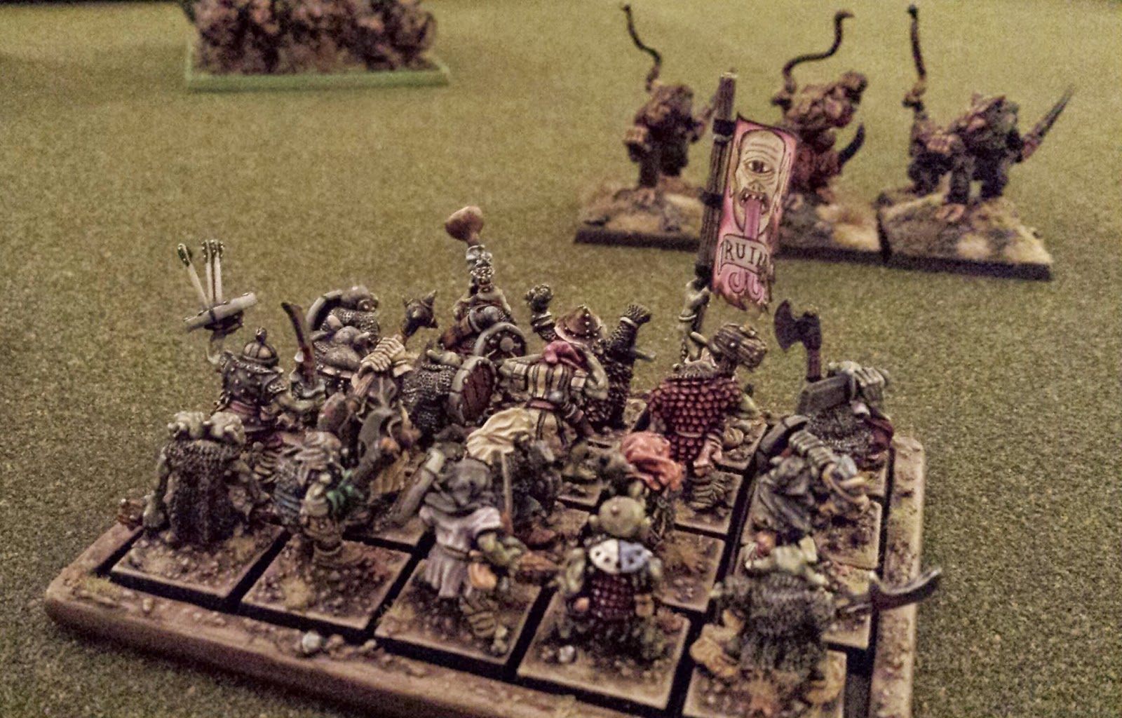
The orcs deploy in a long line while the Skaven player positions his Clanrats in a tight formation. The Giant anchors the orc middle. This was a mistake.


On the other hand, Clan Scourge was a model of elegant design. It was certainly not the work of rules-lawyer or a win-at-all-costs competitor, Rather, 24_Cigarettes' Skaven army was simple, balanced and very ratty. The centerpiece of his force was two huge units of Clanrats, each bolstered with a Clan Skyre Warpfire Thrower (to punish the orcs for keeping their distance) and a Clan Pestilens Plague Censor Bearer (to punish the orcs for getting too close).  


"Arl need 'nuther cider fore I bash dem ratters."


The battle started off with my Giant Rotwang failing his drunkenness roll and showing up for the battle snozzled. Instead of charging into the ratters like a good boy, he sort of staggered toward stage left, giving the Skaven Warpsquealer time to cast Cause Panic upon him. Under the influence of this spell, Rotwang caught a terrifying glimpse of sobriety and booked it off the battlefield. The rest of my army marched doggedly up the centre and into a hurricane of Skaven flame, fumes and Jezzail shot. Only a feeble green rump emerged from this onslaught, and it was no match for the massive phalanxes of unhurt Clanrats. A daring flank attack by Warspoor's Gobbo Wulfboyz offered a glimmer of redemption, but it was only a glimmer: the tide of rats swamped the orcs and drove them from the field. 


The orcs attempt to flank the skaven, but are decimated on the right by the fiery weapons of Clan Skyre and menaced on the left by the rat ogres of Clan Moulder.


"Oi boss! Why are doz big 'airy finks coming dis way?"


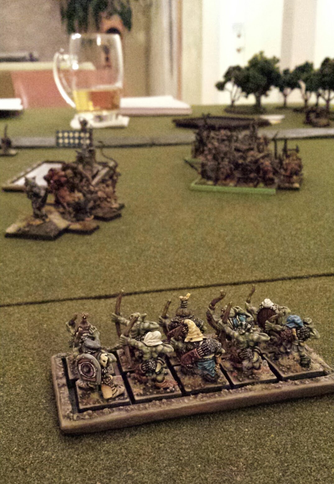
From the safety of the extreme left flank, the small unit of goblin archers watches the rest of the army getting eaten. In their extreme terror, they have a vision of a cider.

Besides being beaten like a gong, I had a great afternoon. Seeing two carefully painted armies on a table is among the most satisfying feelings I know (leaving unnamed a few other satisfying feelings). To make matters even better, 24_Cigarettes is a mensch, and I can now look forward to many future afternoons of drinking and fighting. I just need to work on army design, and keeping my Giant (if not myself) on the wagon.

UPDATE: Check out my opponent's write-up of the same battle (including his Skaven army list) here: Full Ashtray Gaming

Bob Olley and Iron Claw: the Weird Turn Pro

$
0
0

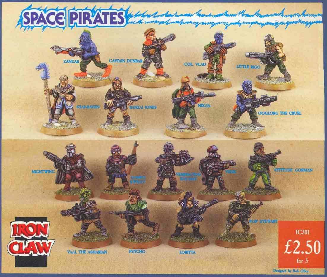
Bob Olley was the most artistic miniature sculptor during Citadel's golden age of the mid-1980's. I wouldn't say he was the best sculptor; that is a matter of taste. Nor was he the most popular (I've seen his sculptures described as "chubby" and "fungoid"). And he certainly wasn't the most prolific - he only created a handful of ranges, including Norse Dwarves, Skeletons, Space Pirates, and (my favourite) Black Orcs.


Black Orc by Iron Claw Miniatures, IC601 (sculpted by Bob Olley, 1988)


So why is Olley the most artistic? Oscar Wilde said "art is the most intense mode of individualism that the world has known". If you take this as a rough definition of art, then Olley was a true artist. Most Citadel minis reflect the world of Warhammer. Bob Olley's miniatures reveal something about Bob Olley. Something weird. He combined an idiosyncratic sculpting style with a fevered vision of the fantastic. The resulting body of work is totally different from that of his peers.Whether you like them or not, you know a Bob Olley sculpture the moment you see it.


Olley didn't work in the studio with the other Citadel sculptors, which may have insulated him from their influence. In any case, I think Olley's individual style is the reason why, starting in 1987, Olley's miniatures were produced by Citadel but released under Olley's own label, Iron Claw. His strangely proportioned and hyper-textured models didn't fit in with any other range. And indeed, I think this limited his popularity: Olley's miniatures stuck out from other Citadel miniatures like visitors from another dimension.

But popularity isn't everything. What I prize in a miniature is a sense of personality, combined with true imagination. Olley has both qualities by the spoonful. Heads and hands are the most expressive element to any miniature, and one of Olley's hallmarks is over-sizing these features. His huge faces attract the viewer's eye, and give him a broad canvass to turn each miniature into a character (often, a very funny character). 

The other hallmark of Iron Claw miniatures is a deeply carved texture. This gives the minis a layered effect, with shaggy furs, warty skin and thick beards piled on top of each other. In this sense, Olley was a master at translating the defining artwork of John Blanche and Gary Chalk into lead.


In my view, Olley's artistic flare is emphasized by the fact that he didn't actually need to sculpt that way. He's perfectly capable of making miniatures that look like everyone else's miniatures when he wants to. There are dozens examples of "normal" looking miniatures in his body of work, although I own only one of them: the Demonic Lasher from Reaper Miniatures (2003). 


This miniature is another example of Olley capturing the essence of a great fantasy illustrator -- in this case, the sketch of the demon prince Demogorgon from first edition Advanced Dungeons and Dragons Monster Manual (1977). It's a pretty odd concept for a miniature, but Olley's sculpt is no weirder than the original picture by David Sutherland III (aka DCS). All of which is to say, I love this mini, but it doesn't have the eccentric carving style of a true Olley.


Demogorgon, Prince of Demons


Next week, I'll feature a full set of Bob Olley's true originals: the Black Orcs he produced for Iron Claw in 1988.


Viewing all 190 articles
Browse latest View live